


Western Merchant
For Everyday People, By
Everyday People
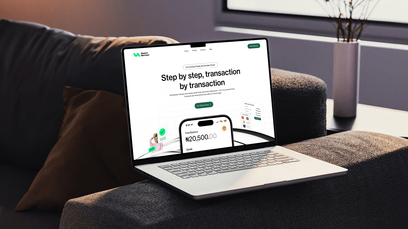
In the bustling streets of modern life, Western Merchant stands out as a beacon of simplicity and accessibility, born from the fabric of everyday experiences. It transcends being merely a fintech brand; it embodies the values of community and inclusivity. Understanding the hurdles of financial management, Western Merchant presents a robust yet approachable platform for its users. Whether it involves sending money, conducting transactions, or utilizing a debit card, Western Merchant strives to ensure a seamless and intuitive experience.
But what sets Western Merchant apart isn't just its technology - it's the people behind it. They are not bankers in suits; they are neighbors, friends, and fellow everyday people. Western Merchant has been meticulously crafted with the same care and consideration that we apply to our own lives, ensuring that every feature, every service, and every interaction is designed with you in mind. At the end of the day, Western Merchant is not just a fintech brand; it embodies a community of everyday individuals, supporting one another in navigating the complexities of modern finance, one transaction at a time.

Brand Development
Blend of Innovative edge
and Customer-Centricity
At the heart of Western Merchant's brand development lies its people. Rooted in a deep understanding of market trends and consumer preferences, the development process centered around collaborative efforts and extensive research. It was through these endeavors that key attributes resonating with the target audience—quality, vibrancy, stability, and customer-centricity—were identified and incorporated into the brand's essence.


Typography Spotlight
Neue Haas Grotesk
Attention to detail is paramount in every aspect of brand development. That's why the choice of Neue Haas Grotesk as the primary typeface is deliberate. Its clean lines and modern aesthetic not only align perfectly with the brand's values of simplicity, sophistication, and innovation but also ensure a seamless visual experience across all platforms. By utilizing Neue Haas Grotesk, The aim is to elevate Western Merchant's identity and reinforce its commitment to providing users with intuitive and effortless money management solutions.


Color Palette
Reflecting Our Identity
The choice of colors for Western Merchant's branding is purposeful and reflective of the core values. The primary green signifies growth and innovation, while the secondary green represents stability and trustworthiness. White emphasizes clarity and simplicity, ensuring our communications are easy to understand. Finally, black adds sophistication to our visual identity. Together, these colors create a cohesive palette that conveys Western Merchant's commitment to innovation, trust, and excellence in financial management.


Client: Western Merchant
Designer: Daniel Owolabi
Designer: Daniel Owolabi
Email: owolabidaniel30@gmail


